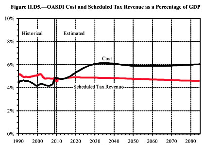
Posted by Kevin Drum, this chart is from the trustee’s report. Ezra Klein has a posting about it here.
The reason that this chart is so important is that it shows that SS costs don’t continue to rise forever, they increase from about 4.8% of GDP (where they are now) and level off at about 6% of GDP. We can fix that with relatively small adjustments.

